Prestige High FieldsHi-Tech City, Hyderabad
Prestige High Fields
Hi-Tech City, Hyderabad
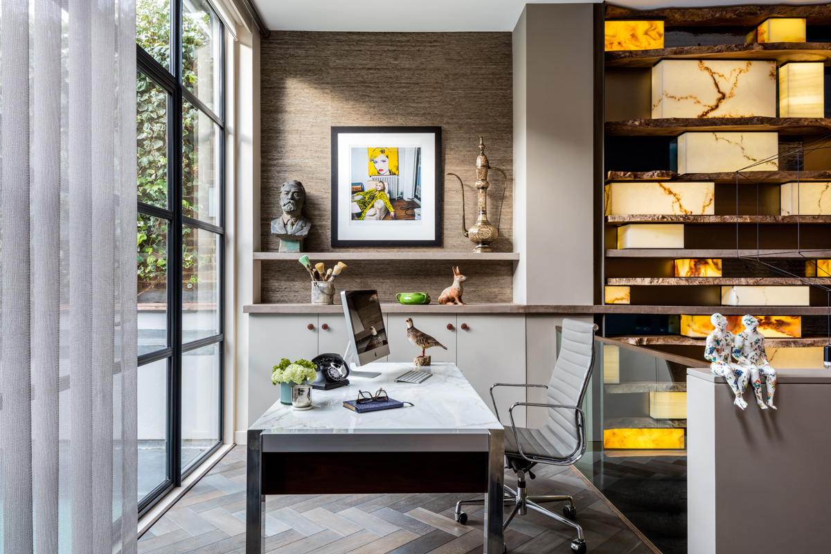
A view of the desk facing the garden, with a wall finish that links the interior with the exterior. Inside, the cupboards are linked with the concrete top wall installation, which stretches right along the entire length of this floor.
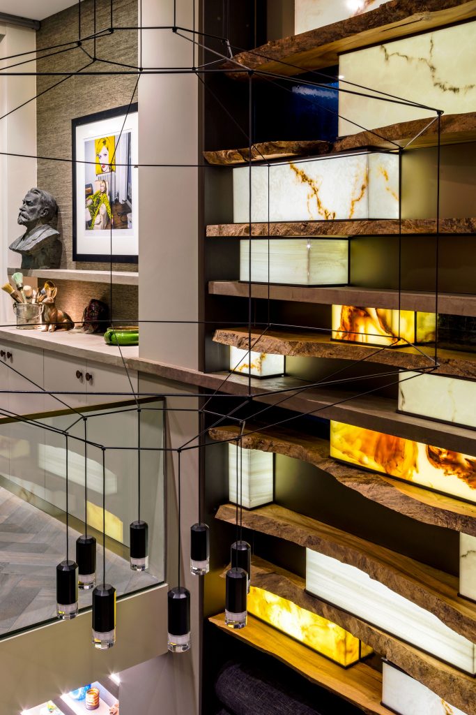
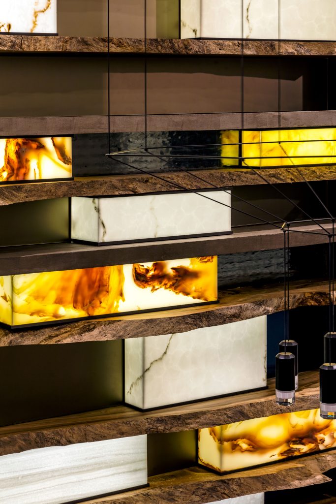
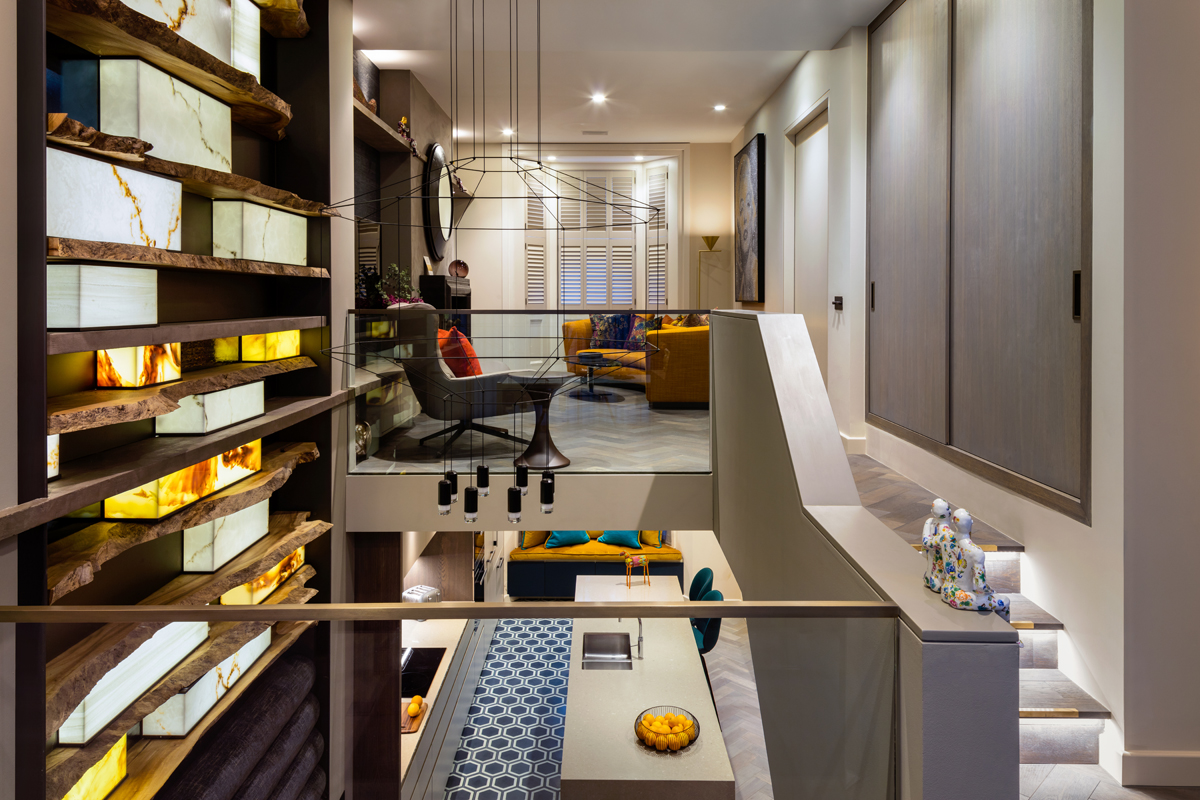
Working with Whetstone Oak we created this light installation between the ground floor and basement in order to connect the two floors visually. The shelves are made from raw kiln dried wood, with marble lanterns that are computer controlled to individually dim the lights up and down. It was quite a feat as neither of us had done anything like this before.
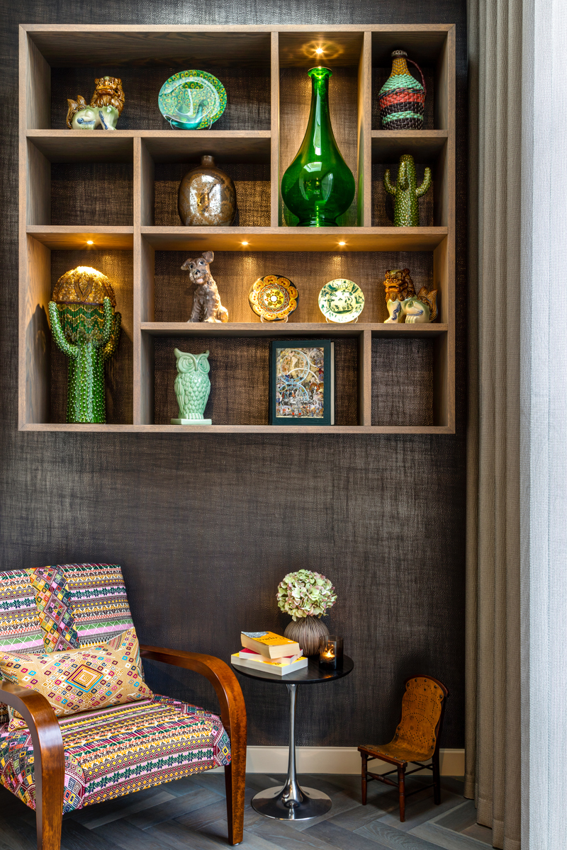
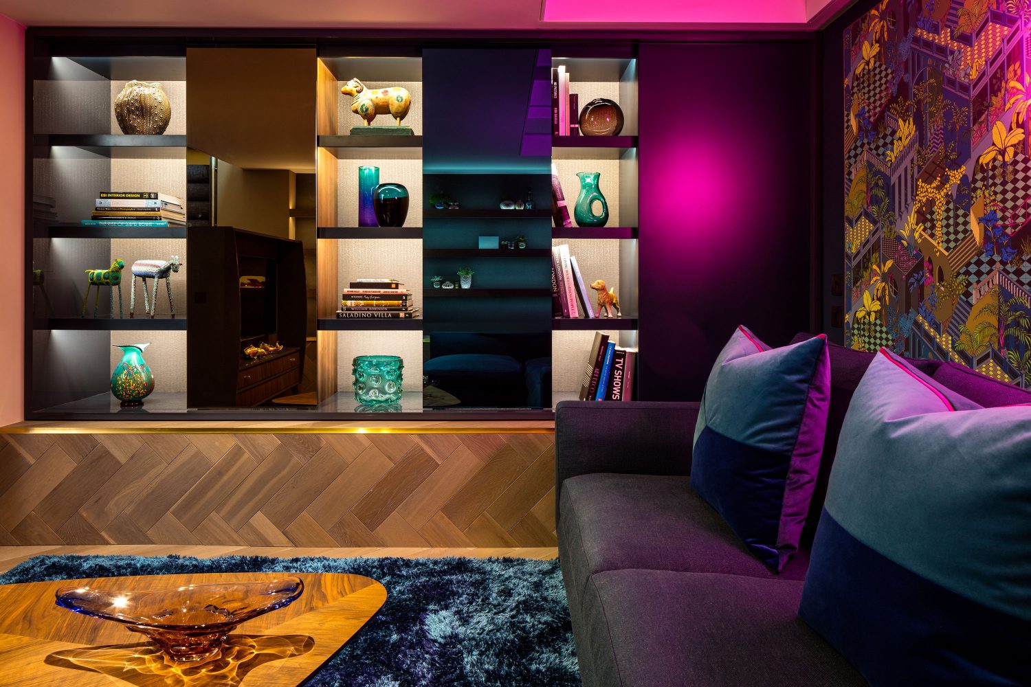
The shelving is designed to create a display for the owner’s collection
The footprint of each floor is relatively small, but by opening the space up we create a flow between each.
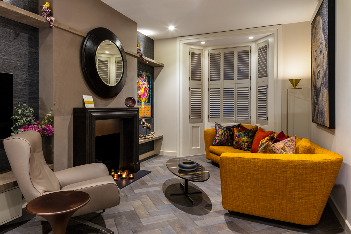
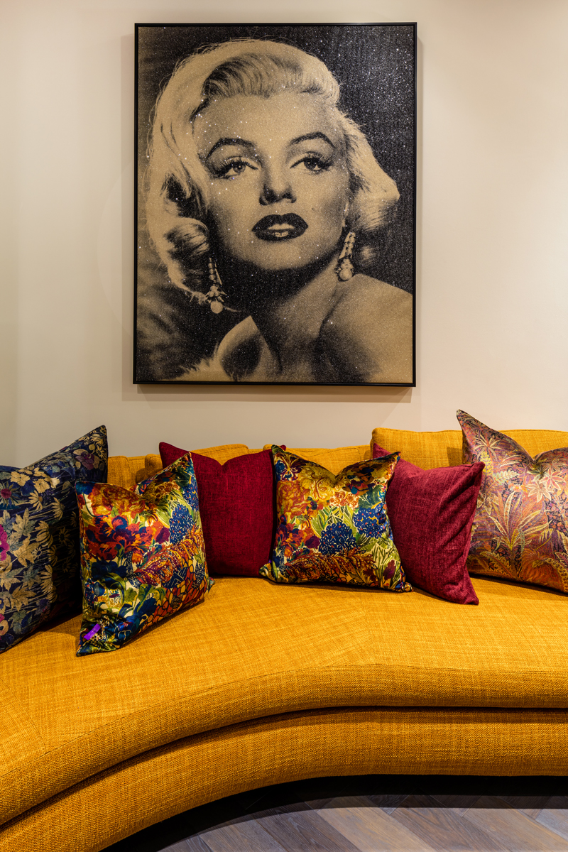
In order to maximise space in the living room a curved sofa by Minotti London was used. The décor is textured and earthy in tone, but spiced up with bright orange as inspired by the owner’s art.
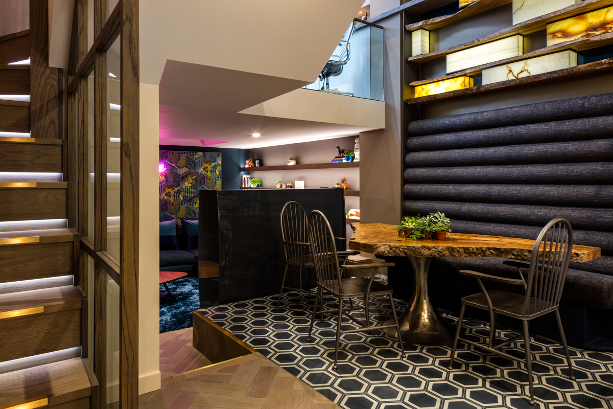
The light installation hovers over the dining area with a high backed banquette, which again is designed to link the two floors.
The script reading room boasts a display unit with moving panels, designed so the display is ever-changing.
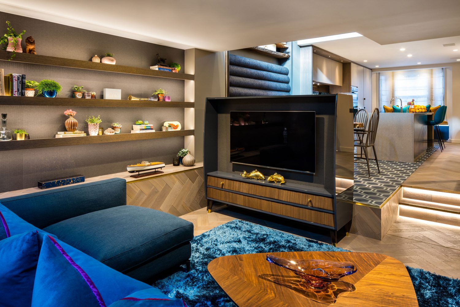
The TV unit is designed to look like a 50’s radiogram, with horsehair panels hiding the speakers – the idea deing that not everything should be taken too seriously.
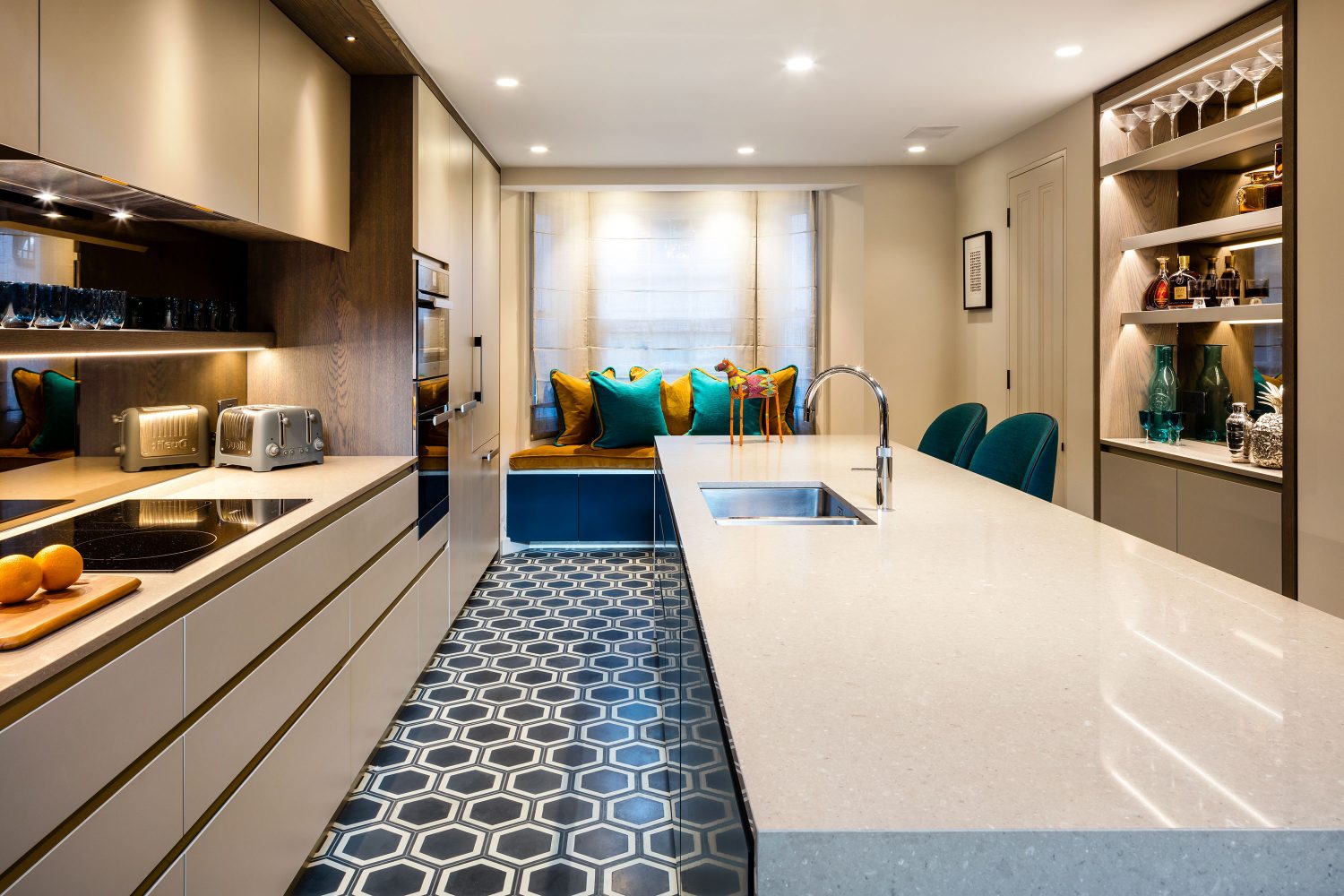
A sleek kitchen designed and built by us with quirky, but not gaudy, tiles by Bisazza.
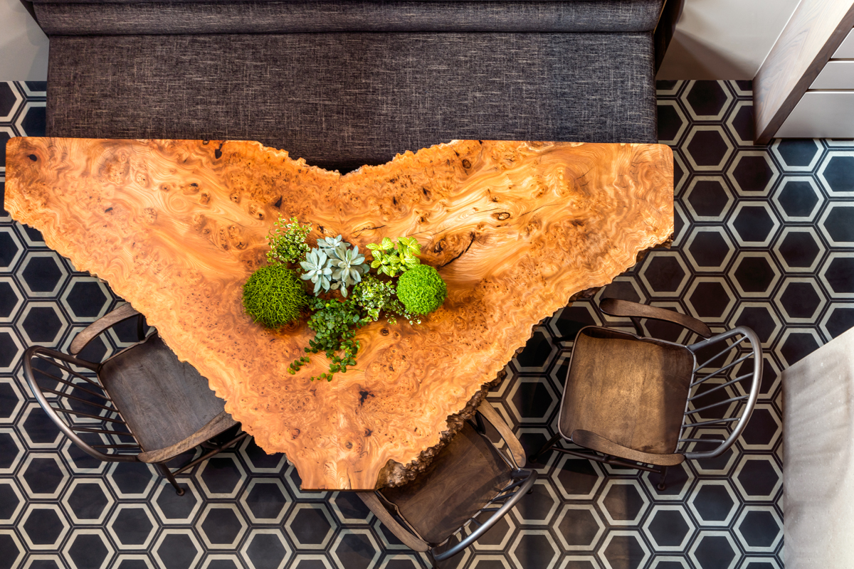
The dining table is two pieces of sliced tree joined together, the idea linking with the wall panel as seen from the floor above.
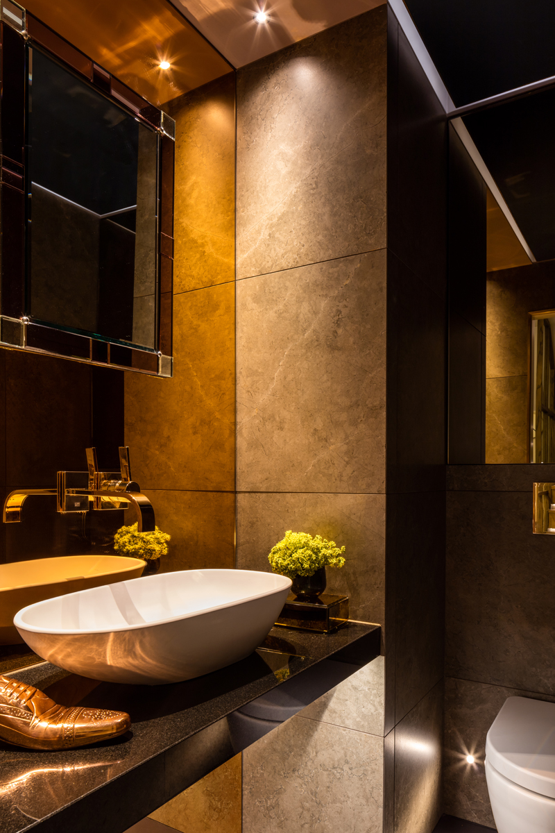
A fuss was made of the guest loo, an air of opulence created by hanging the mirror and taps from a copper coloured mirror. It is designed with parties in mind.
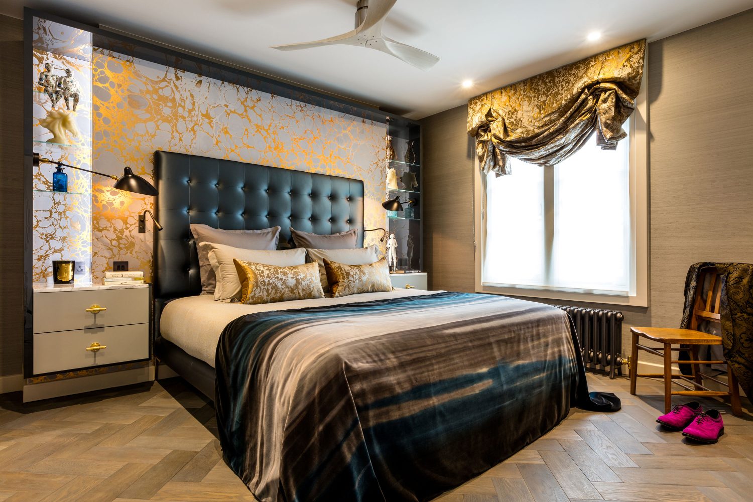
Unable to hang long curtains because of the radiator, but wanting a bit of grandeur, London blinds were used. They are a tad old fashioned too.
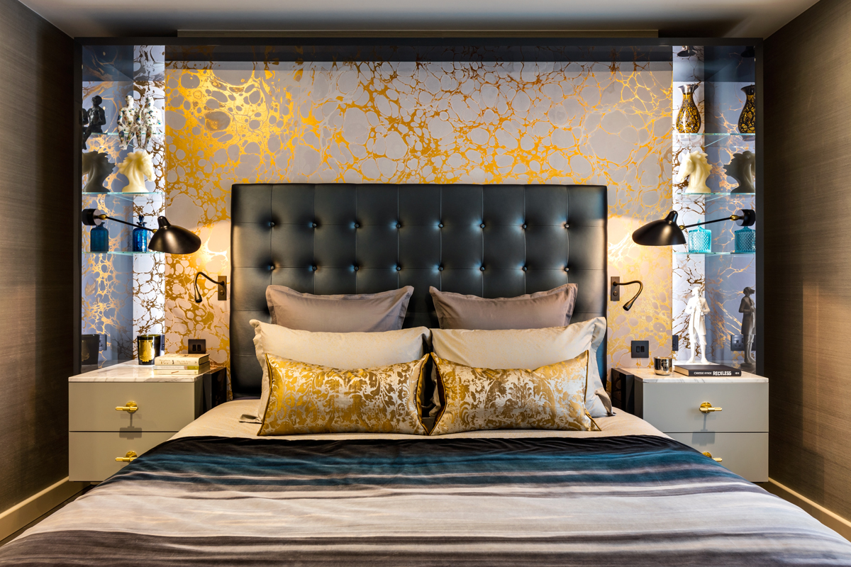
It may be a bedroom but it is better described as the throne room and it just glows. It also hides the chimney breast.
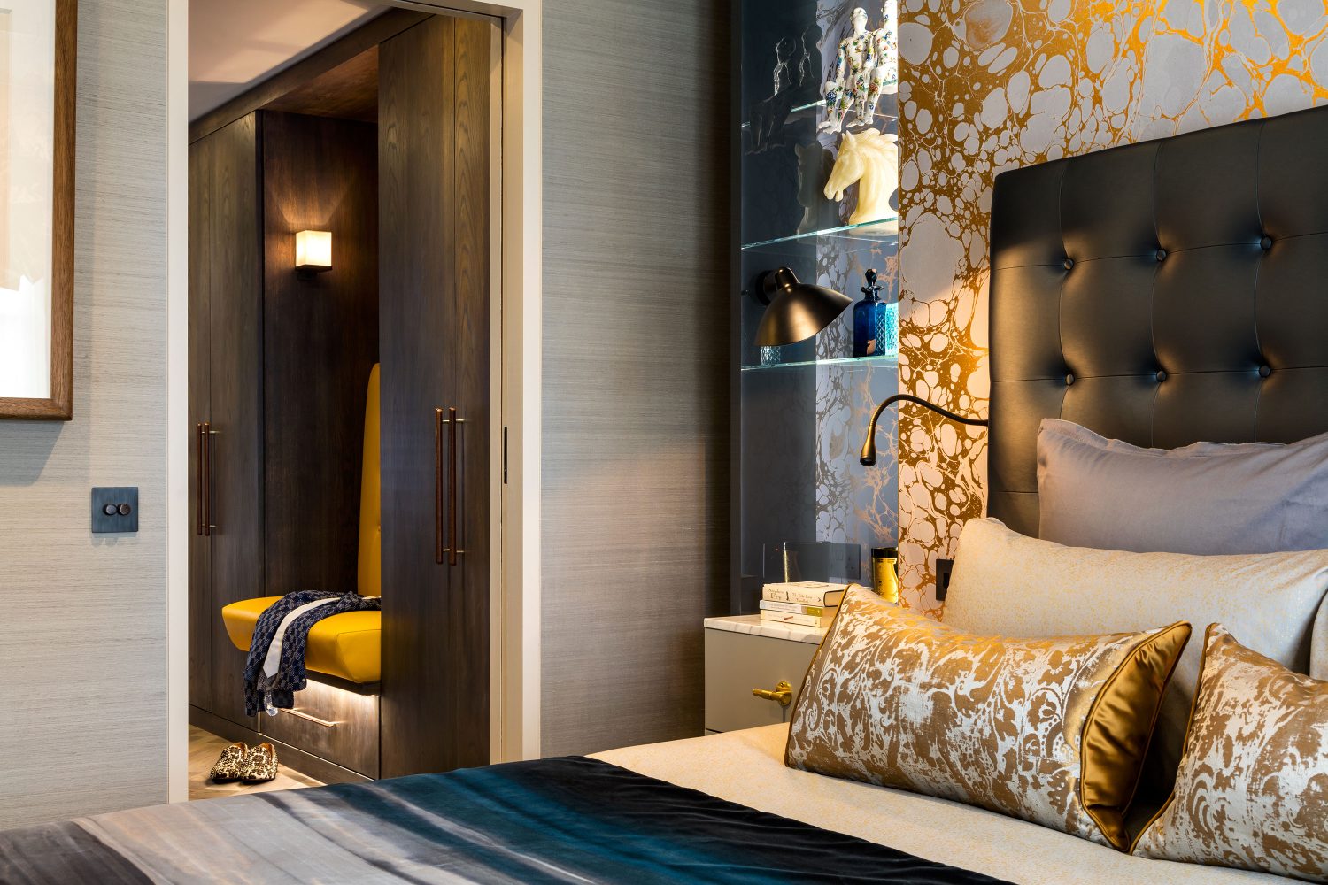
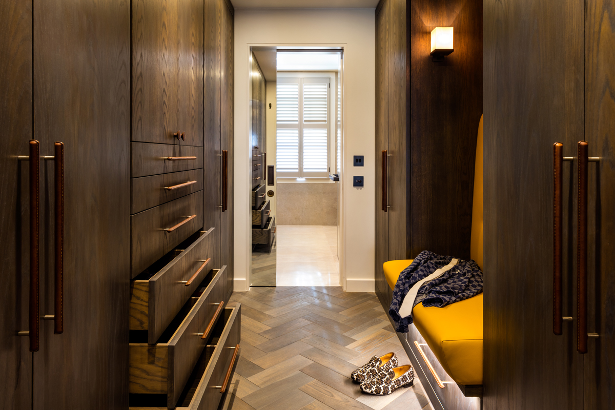
A peek into the moody dressing room is lifted by the leather banquette. The handles are made by saddler Matthew Payne. The cushions were made by Frankie, our soft furnishings expert, and were nicknamed McDonald’s apple pie cushions.
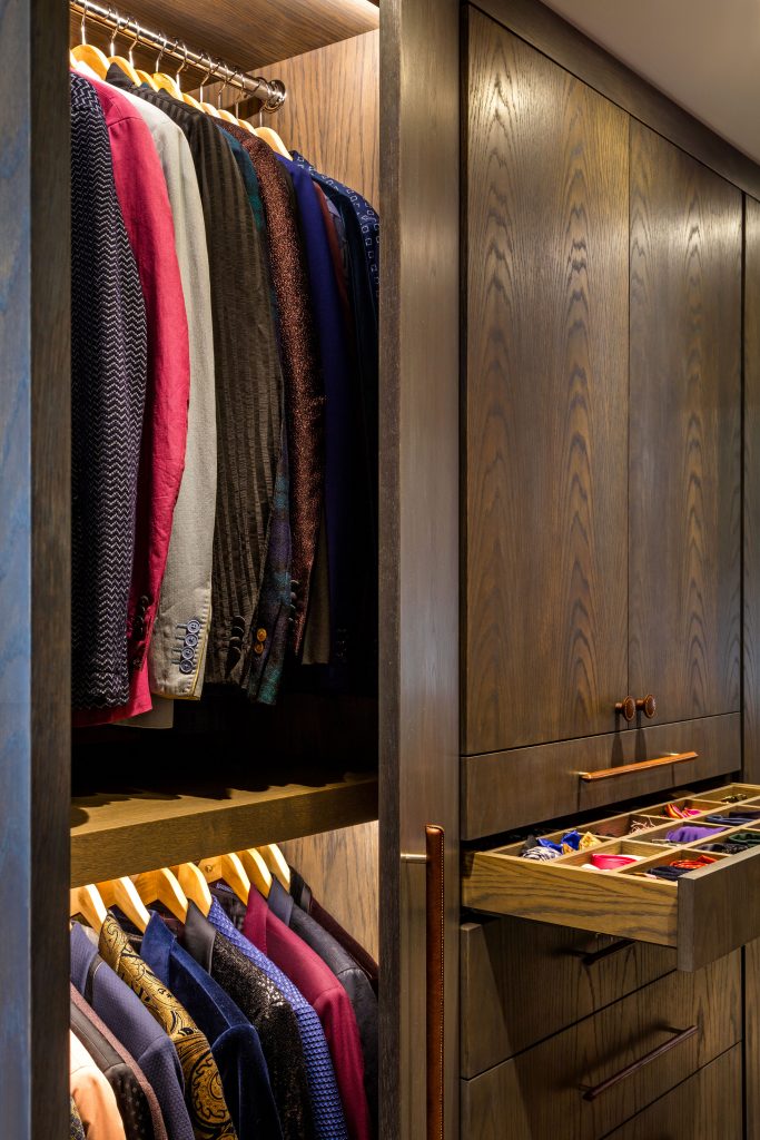
I don’t think we’ve ever had a client who doesn’t have a lot of clothes, ensuring there is a place for everything is our job.
A peek inside the wardrobe shows you our inspiration when designing the house.
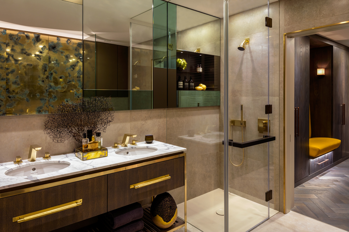
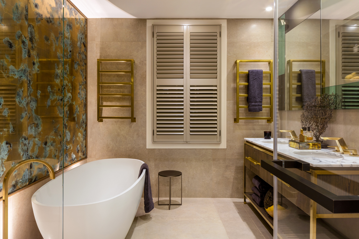
Bathrooms are becoming more sophisticated these days; here the aim was to inject personality and individuality.
The panel above the bath is made by Emma Peascod. The mood gold gilding behind glass creates a soft warm feeling in a room that can often look too clinical.
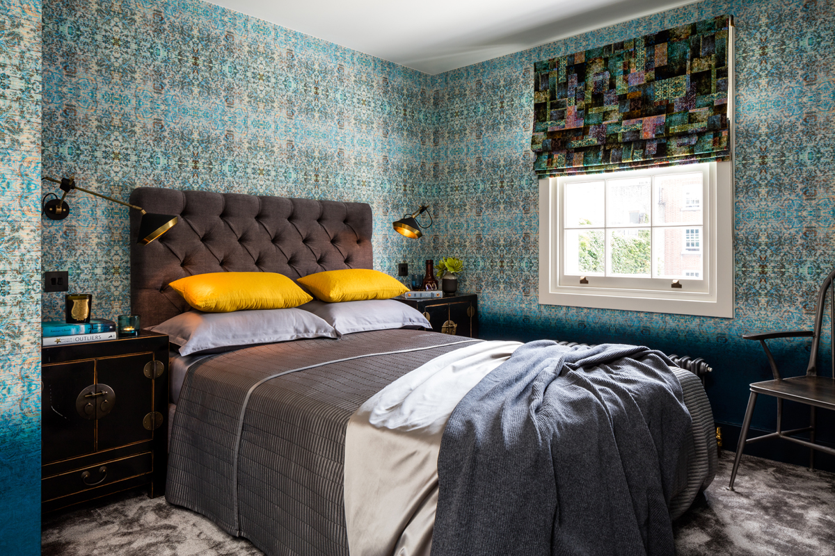
A guest room should be a best room. We certainly made a fuss of this one using ombre wallpaper and fabrics from Blackpop.
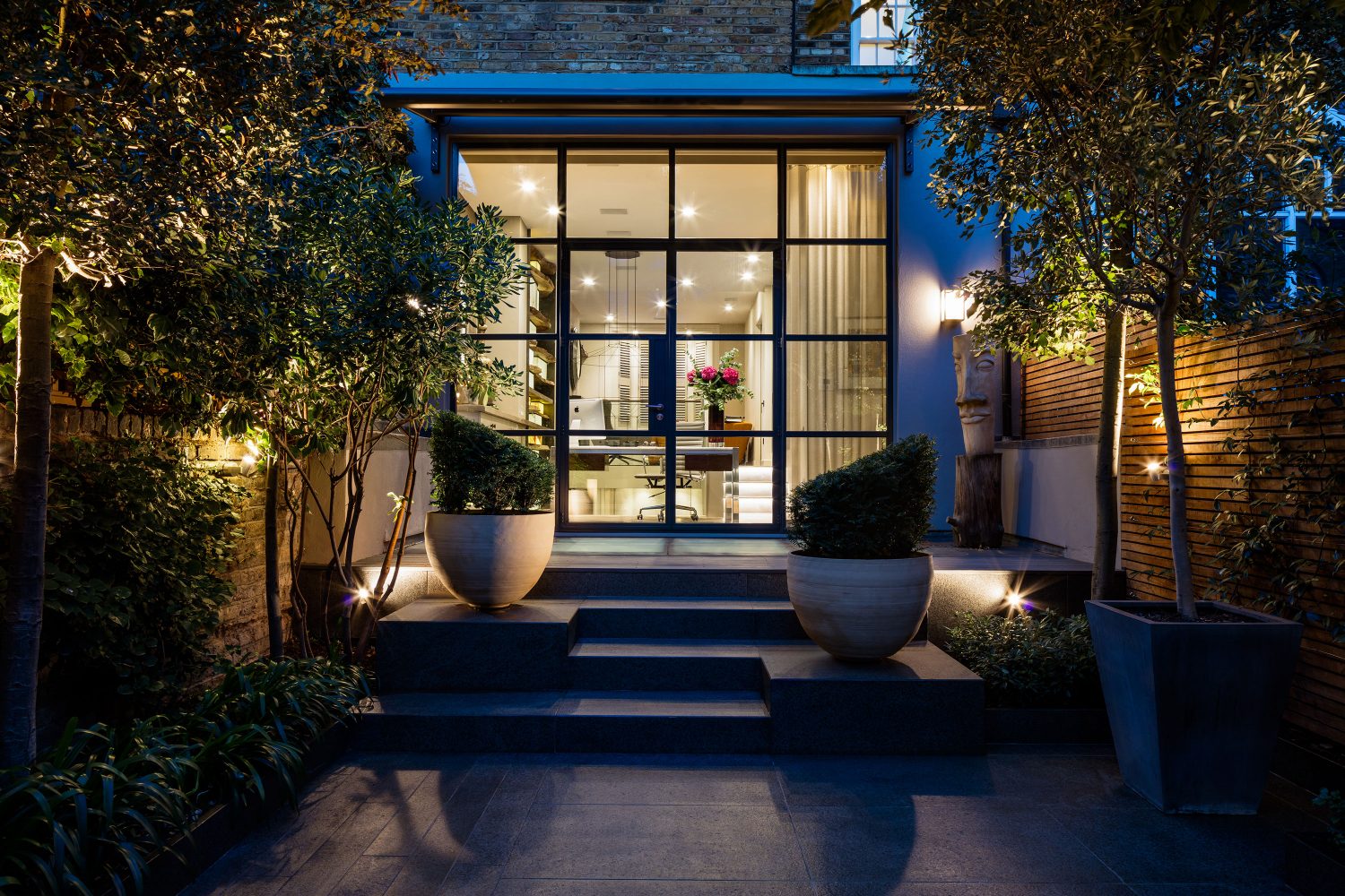
The Crittall windows were designed to frame the garden, which was designed by Simon Mulhearn to link with our interiors.
Simon’s raw wood wall links with the wood and marble installation inside.


